Sass is a mature and stable CSS extension that adds superpowers to your already super powerful CSS. Think of it as adding some JavaScript magic to your CSS, sounds cool right? You might be building a medium to large scale multi-user Vue application that requires some level of customisation for each user; Sass is a great way to do this. In this tutorial, I’ll be showing you how to theme and dynamically customise your Vue 3 applications with Sass.
Let’s dive in.
Setting Up Vue 3 with Sass
If you already have your Vue 3 project setup, you can skip this step. We’ll be using Vite in this tutorial. Vite is a lean, super fast and highly extensible development server and build tool. You could also use Vue CLI.
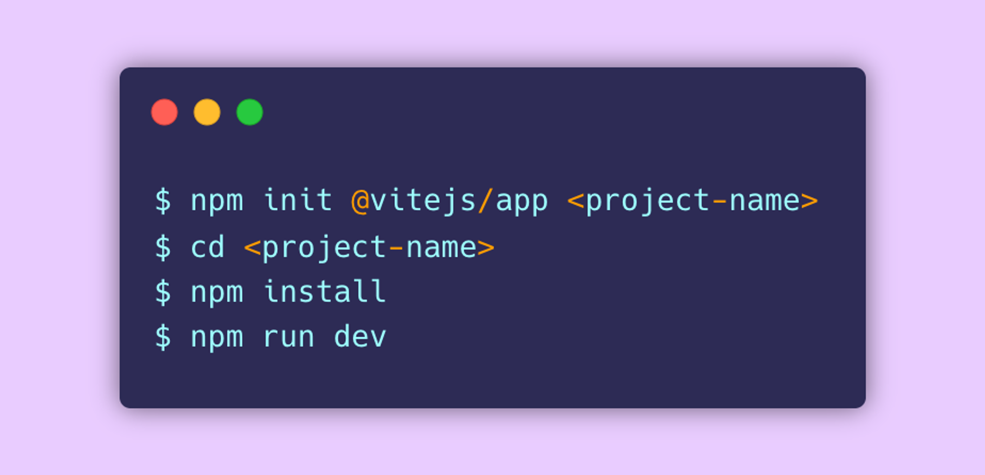
Vite provides support for Sass and other CSS extensions out of the box, so after initialising our project, all we need to do is install the Sass pre-processor. We can do this with npm install -D sass .
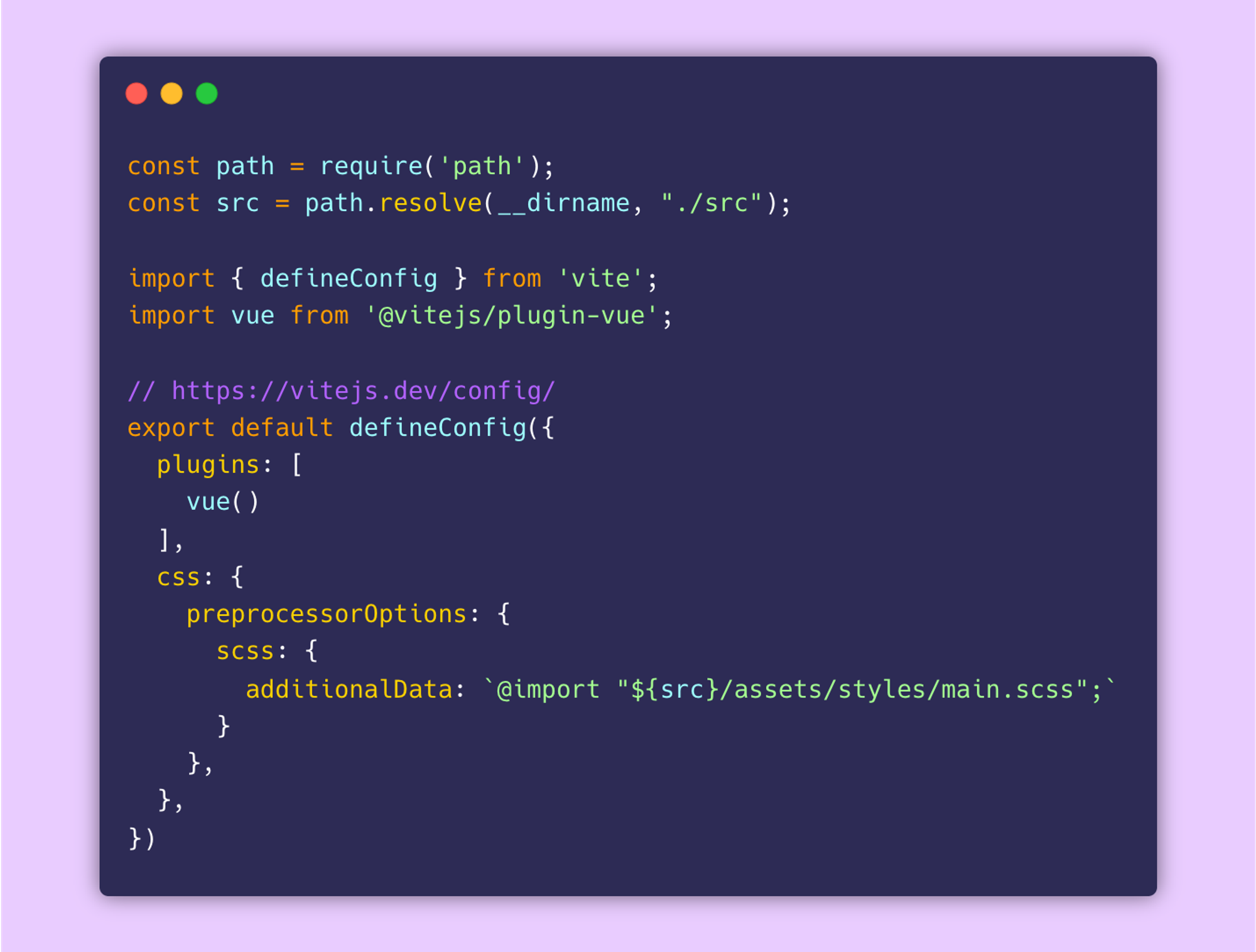
Great, now that our project is setup, let’s go one step further by making our Sass globally available to our application (define once, use everywhere). This step is optional but recommended if you’re building at scale and need global styles or simply want to keep your code-base organised. Inside src/assets let’s create a new folder called styles, and inside that we’ll create a main.scss file. This will serve as the entry point to all the other scss files we want to make globally available. Next, let’s tell Vite about this.
Theme Approach
Essentially, we want to be able to change the style of our app by setting and changing certain variables. For this app, we’re going to set font-family and color variables and build our themes around them. There are two ways we could do this; on one hand we could allow our app be themed from a curated list of styles (i.e. in our case, fonts and colors) or we could allow our app be themed by accepting any variable and then building the theme from that. We’ll cover both.
1. Theme from list of styles
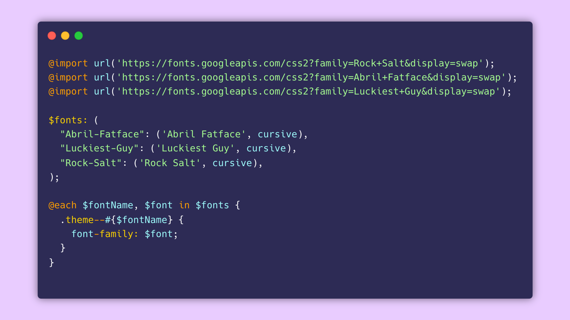
i. Fonts
Let’s proceed by creating a new sass partial inside our styles folder, we’ll call this _fonts.scss . Partials are atomic scss snippets that are meant to be included in other sass files and are named with a leading underscore. Inside, we’ll import some Google Fonts and create a Sass map called $fonts to hold them. Next, we’ll use the @each sass rule to emit styles for each key and value pair in our map. The syntax is @each <variable>, <variable> in <expression> { ... }. Keys and values are assigned to the first and second variables respectively. For each font, we’re creating a new class that sets the font-family to the respective font — .theme-font--#{$fontName} .
ii. Colors
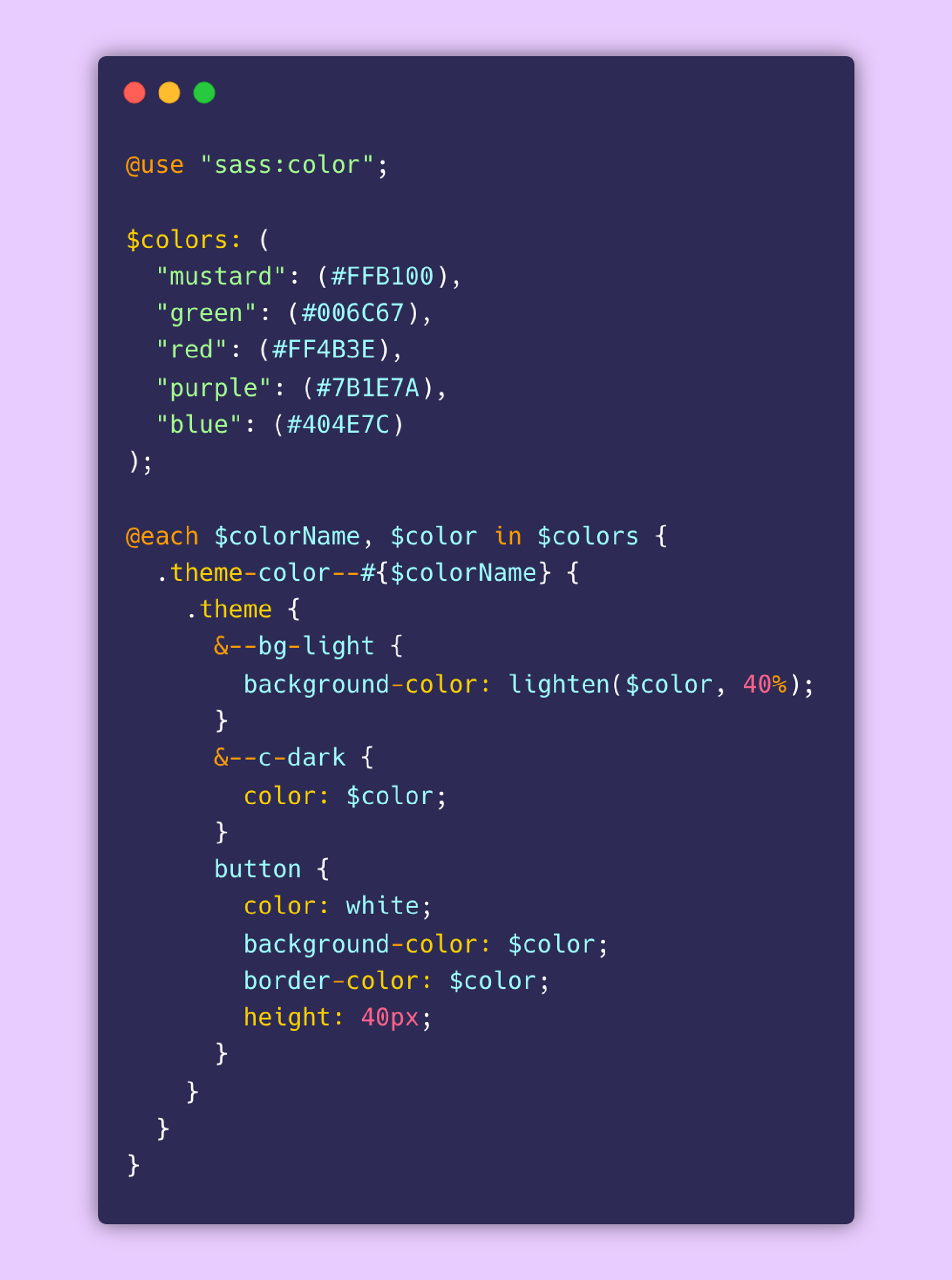
To build our theme from a list of colours i.e. a palette, let’s create another partial _colors.scss inside our styles folder. And just like we did for our fonts, let’s also create a map of all the colors we want in our palette and then emit a class for each color. Next, we’ll nest additional classes for styling our app.
We’ll be using the sass:color module to generate a light variant of our color. To access this module, we need to import it first. Next, we’ll pass our color into the lighten() function along with the amount by which we want to lighten it by. The syntax is lighten($color, $amount) .
2. Theme from any variable
i. Colors
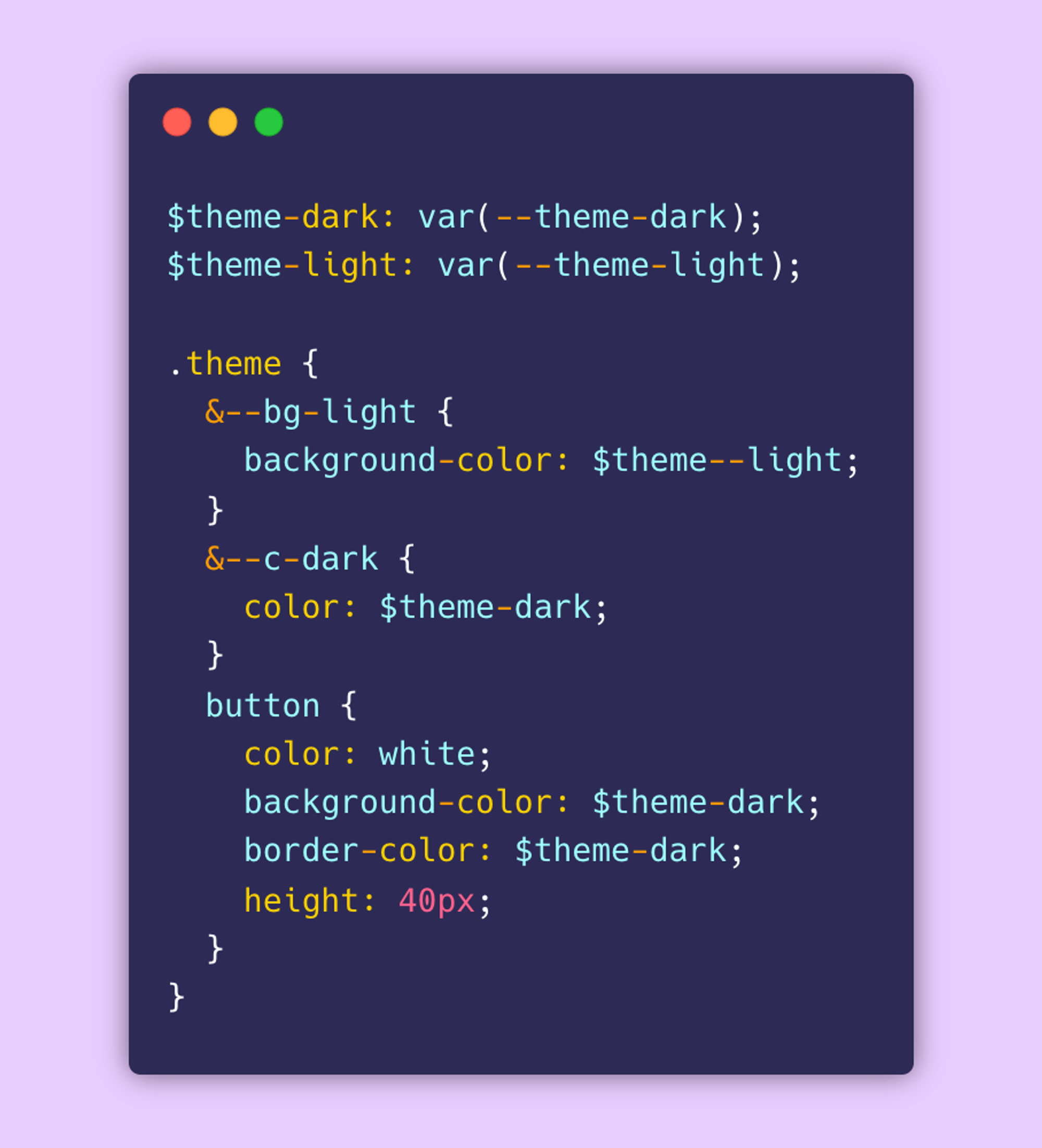
Another approach could be to give users the ability to pick any color for their theme rather than selecting from a defined palette. To do this, we’ll need to pass CSS variables into our sass file to generate our theme. Unlike the previous method, we can’t use sass:color on CSS variables because the sass module won’t recognize them as color. To get around this, we’ll pass two CSS variables, one for the theme color and another for a light version of the theme color. More on how we’ll generate the light version later.
Building Our App
Now that we have our scss setup, let’s build something simple with Tailwind.
Building Theme Picker Components
We’ve defined our theme variables, now we need to be able to control them. We’ll create two components, one for selecting our theme font and the other for selecting our theme color. Inside src/components let’s create ThemeFont.vue and ThemeColor.vue files.
—-
Conclusion
The most recent State of CSS report ranked Sass as the number one pre/post-processor technology in terms of interest, usage and awareness; and number two in terms satisfaction amongst developers. For a technology that’s been around for well over a decade, that’s pretty cool. While there are other more recent tools out there that can get the job done (most notably CSS-in-JS frameworks and styled-components), Sass on it’s own is still as formidable and relevant as ever and doesn’t seem to be going anywhere soon.
